Imagery
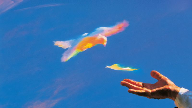
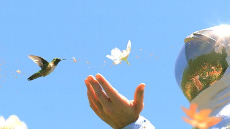
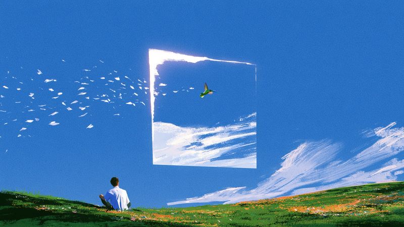
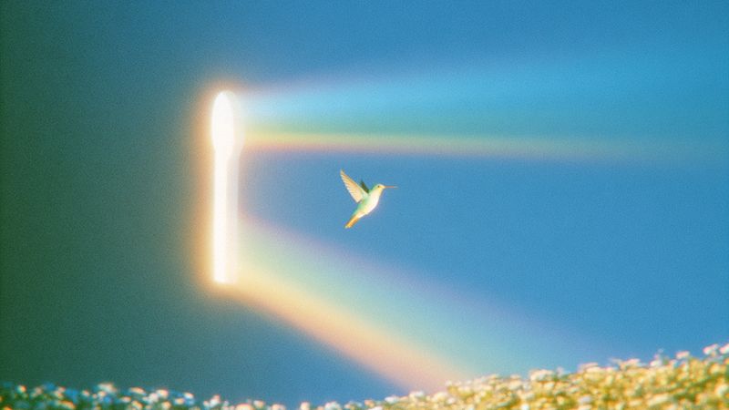
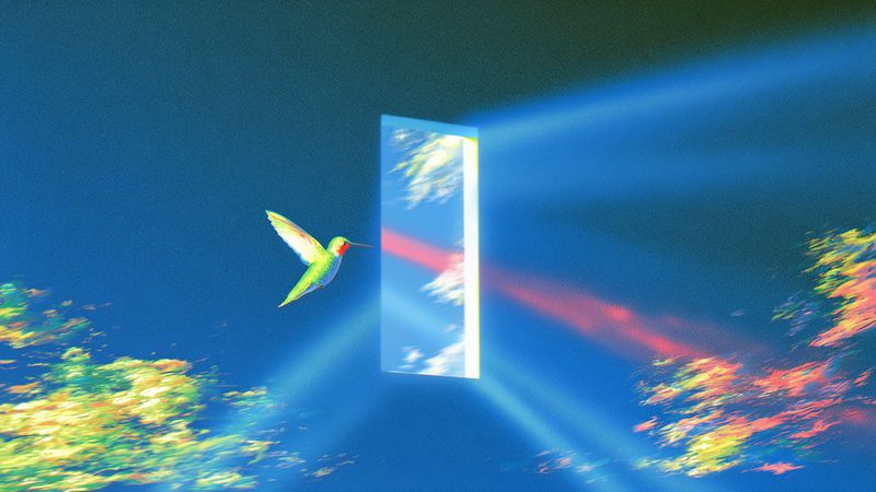
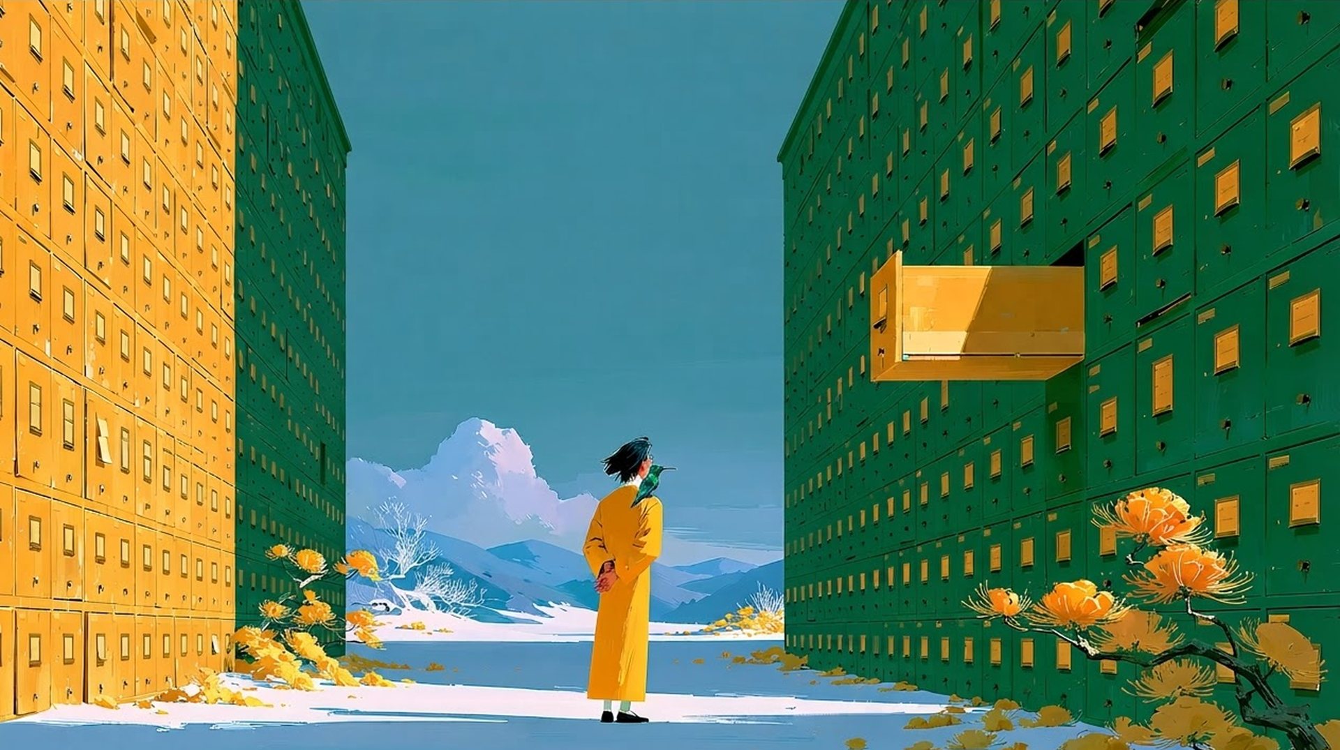
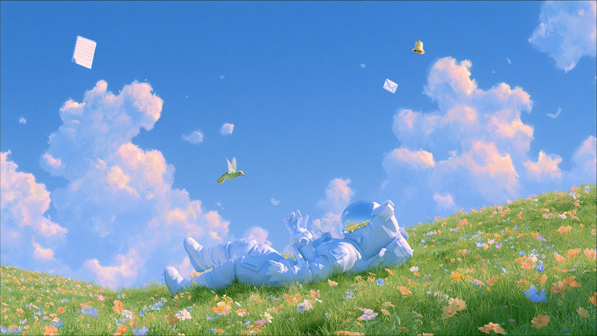
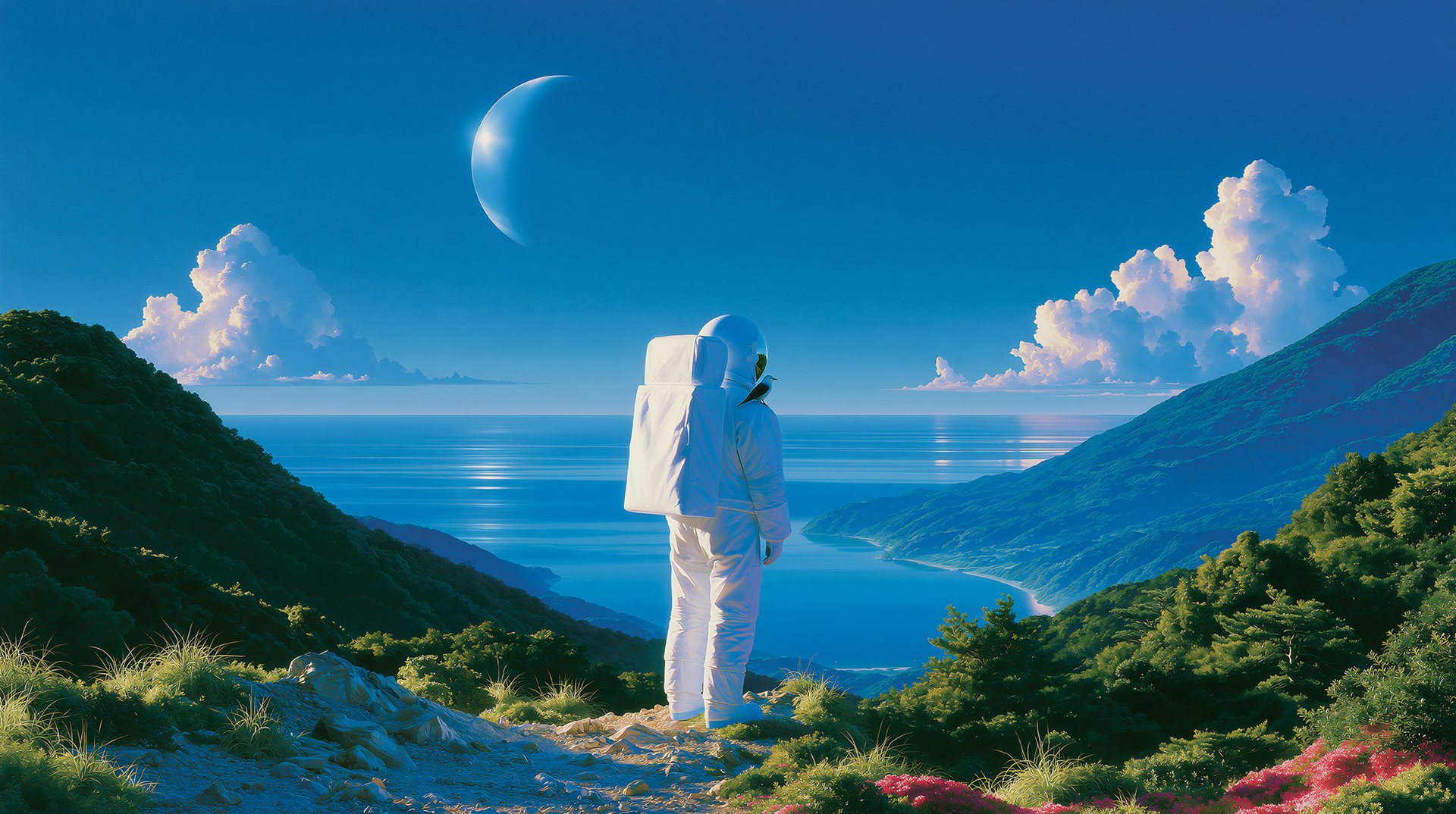
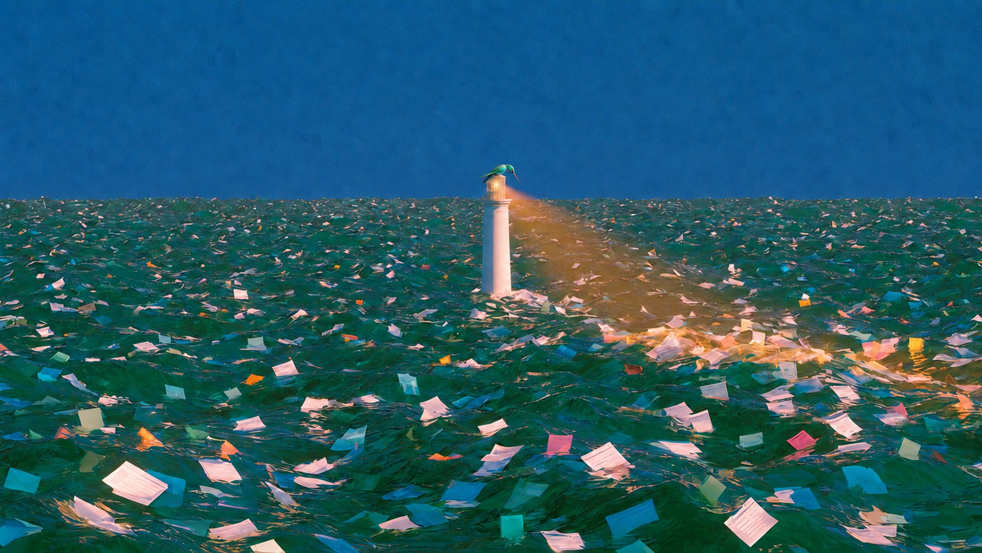
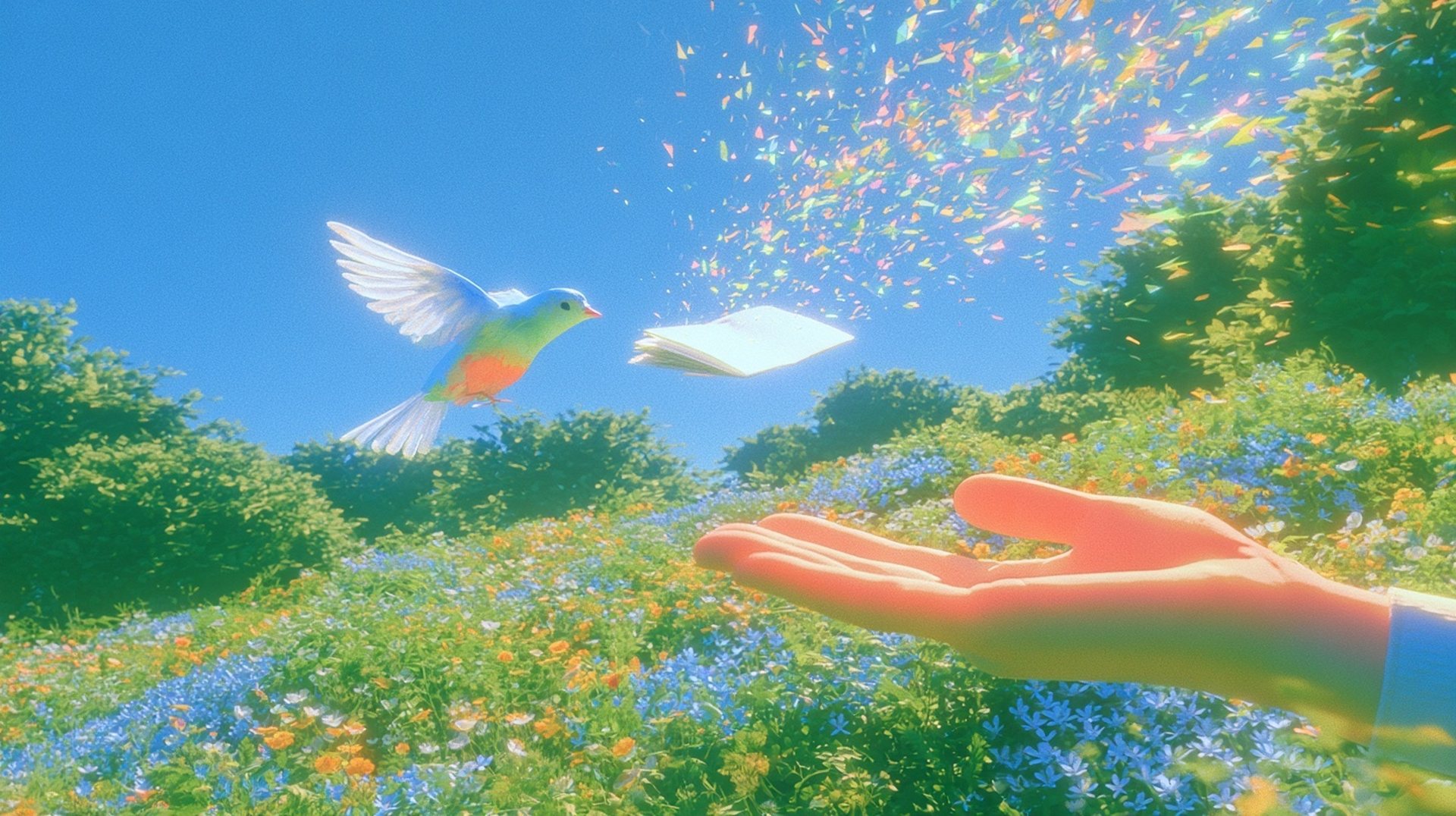
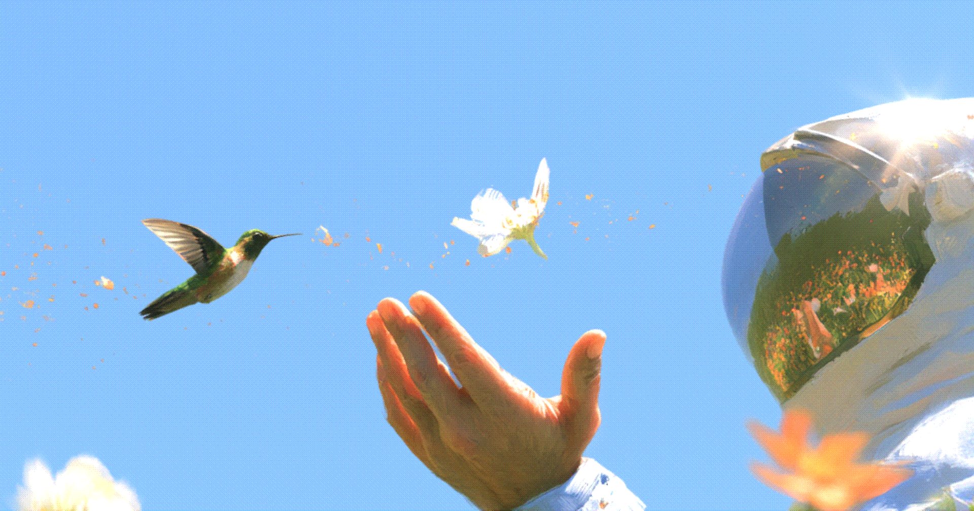
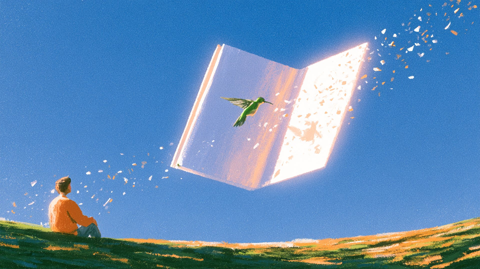
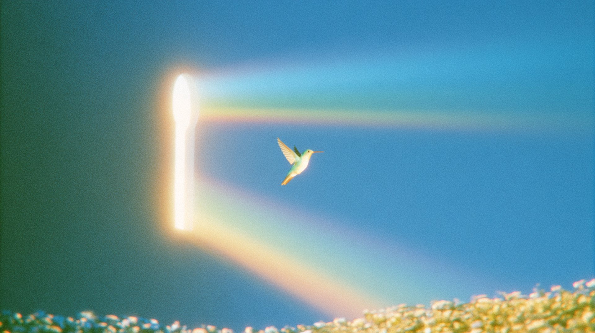
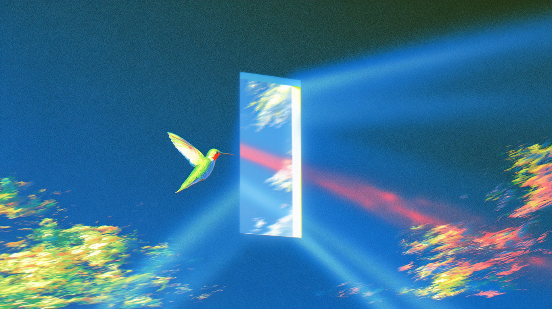
The full cinematic world of the brand: vast scenes, painterly texture, one warm light. Someone doing something big, accompanied by something small that notices everything.
01Visual elements
Vast but warm
Open sky, dappled greens, warm afternoon light — scenes that make space for your thoughts and set a calm, human tone without stealing the show.
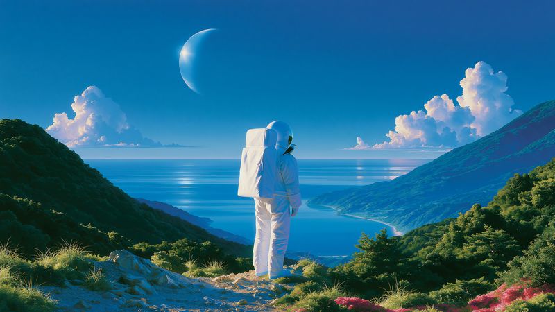
Every image starts from the same brief: a vast scene, one calm person, one small companion. Close-ups are allowed — they move in on the bird and whatever it's with: a hand, a cup, a page. Three visual elements carry it.
Bird — the bird is always present
Presence. Always in frame, never centered. Small in a wide shot; a close-up can bring it near.




Rest — the human at ease
The person rests or wanders.




Vast/scale — big calm worlds, tiny protagonists
A small human plus a smaller bird. Big world, small worries.



02Choosing a type
Reach for the right image
Three image types, each with a job. If you're unsure which one a surface needs, the answer is almost always the quietest one that still does the work.
Compositions
Best for brand moments — launches, covers, campaign frames. The full cinematic world: vast scene, one calm person, one small companion.
Product visuals
Best for showing what Littlebird actually does. Real UI, mono, unretouched — the interface is the brand, never dressed up for the shot.
Applications
Best for surfaces with fixed jobs — social cards, the app icon, store assets. The lockup living inside the brand world, not floating on chrome.
03In use
Applications

04Social
Quiet composition, loud idea
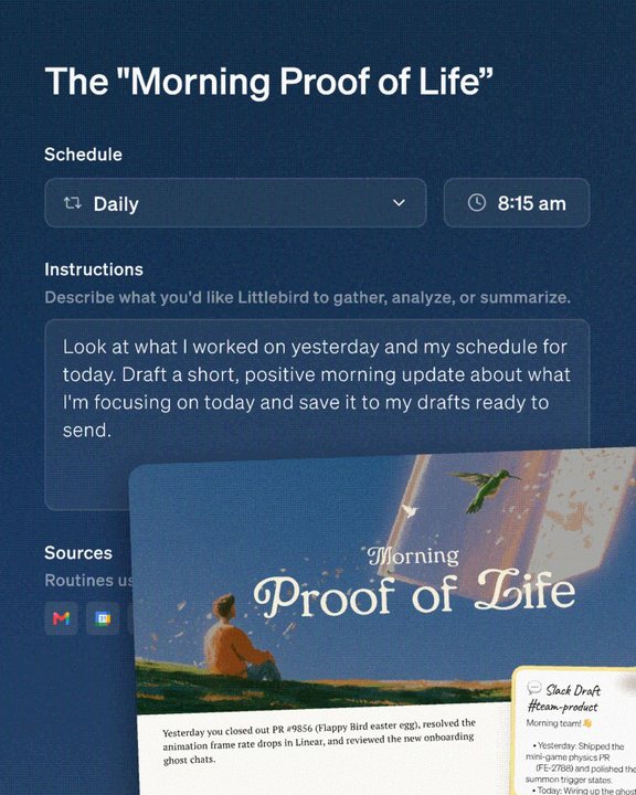
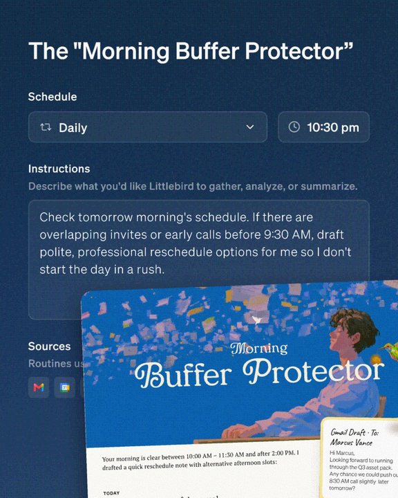
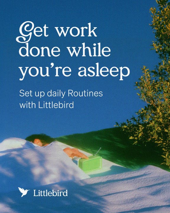
Social is where the brand is loudest. Posts are 4:5 and built from the same few parts every time: the brand world opens and closes, and the product does the work in between.
Carousels
The world on the first and last panel, the product in the middle, one idea per panel.
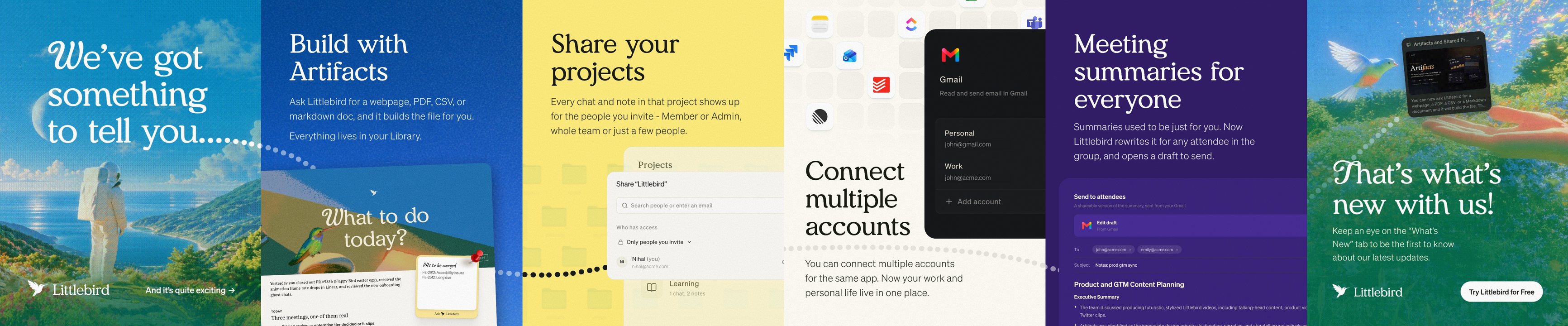
What’s new — six panels, one continuous frame. Swipe through it here the way it plays on a phone.
Open and close on the world
A full-bleed brand image. Meraki headline top-left, lockup bottom-left, one call to action bottom-right — a text link on the opener, a pill on the closer.
Product in the middle
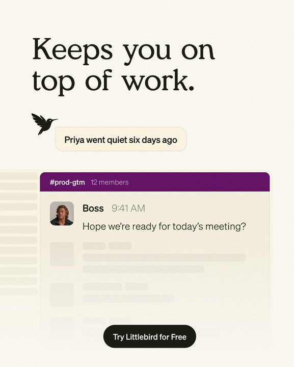
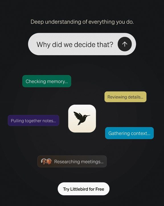
A flat ground — cream, cobalt, yellow, midnight, navy, or off-black. A Meraki headline, a line or two of Söhne, and real UI cropped by the edge of the frame.
Swash capitals over imagery
Headlines set over an image open on a Meraki swash capital. Headlines on flat grounds stay plain. How to set them.
A flight path between panels
A dotted line crosses from panel to panel, the way the bird would, and pulls the eye into the next swipe.
Single posts
The same parts, arranged for one frame.



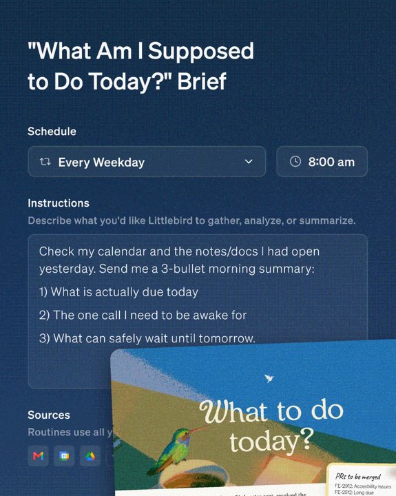
Imagery inside the product
Brand imagery can live inside the product as cover art — and the swash capitals come with it.

05Compositions
Composition library
The rest of the approved brand imagery. Hover any image — here or in Visual elements — to download it as a 1920px JPG, or take all 31 at once.
Brand imagery — all 31 approved images as 1920px JPGs, about 10 MB.
Download imagery